Transforming ProAir’s website into a B2B sales platform.
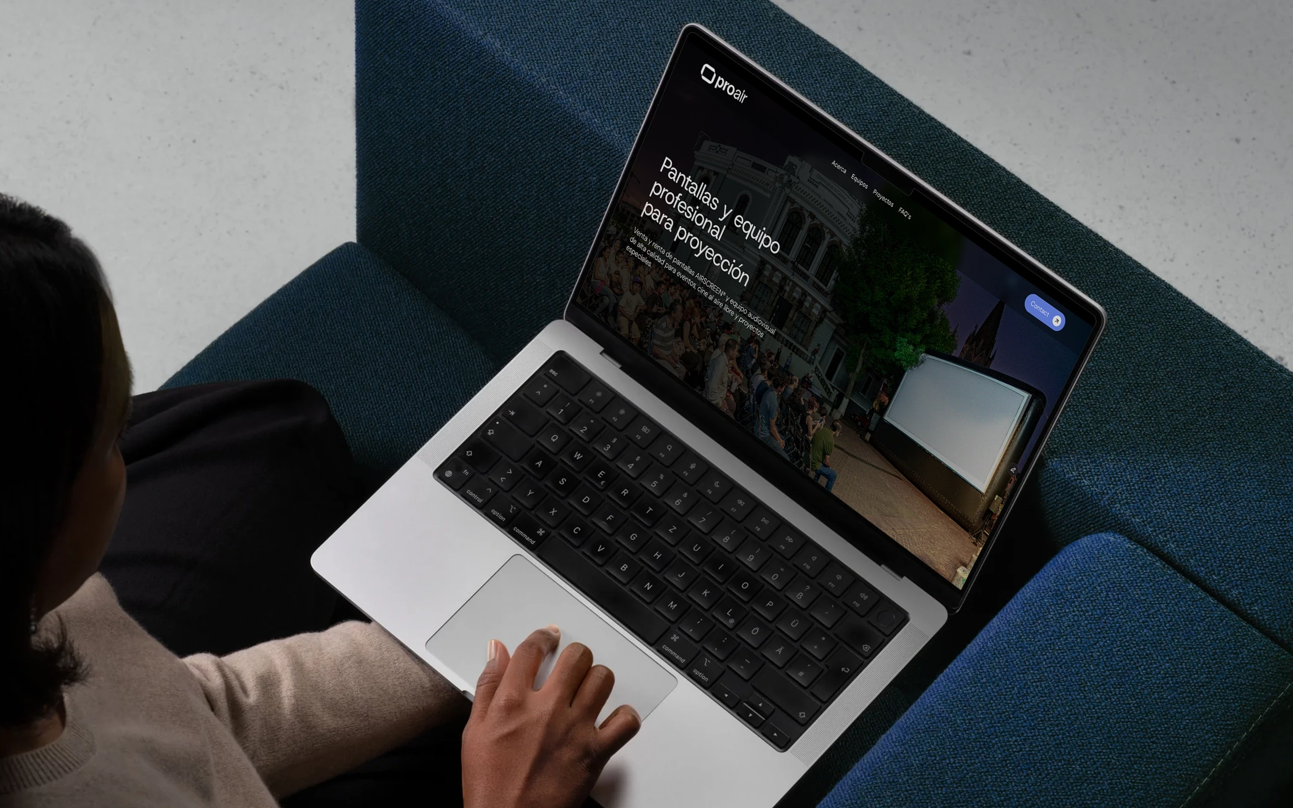
ProAir is the largest provider of professional projection solutions in Mexico, with over two decades of experience supporting some of the country’s most important film festivals, including the Guadalajara International Film Festival (FICG), FICUNAM, and Ambulante.
This case study presents the redesign of ProAir’s website and its evolution into a digital platform designed to support service sales and B2B client acquisition.
client:
ProAir
type:
website
Role:
ux/ui designer
researcher
field:
Event Technology
scope:
Design strategy, business discovery, UX Research, Information Architecture, Interaction Design, UI Design, content design, prototyping and validation.

Understand
How can we help users easily understand ProAir's offerings and close a sale?
ProAir's website functioned as a static portfolio with a confusing site map, unclear services, duplicate content, and no defined conversion paths for sales.
Users had difficulty understanding the offers or how to sign up with ProAir, forcing the company to rely on in-person sales. This limited its ability to capture demand in a growing market.


specify
The research revealed that the main challenge was not the lack of information, but how it was structured and presented. While the website contained extensive content, its organization made it difficult for visitors to quickly understand services and product offerings.
The project therefore focused on clarifying the structure of information, simplifying content, and establishing a clear path from exploration to action.
Business Goal
Use the website as a clear business tool that allows potential customers to quickly understand the offers and move towards requesting a quote or contacting the sales team.
User Goal
Allow users to quickly understand the available services and packages, evaluate their options, and easily take the next step toward contacting the company.
Alignment
Design a structured and intuitive experience where information is easy to scan, services are clearly defined, and users can confidently move from understanding the offering to initiating contact.

design
I followed an iterative process, involving stakeholders at every step to minimize waste and rework.
User Flows
Defined the high-level interaction before moving into screens, mapping how users move from understanding the service to initiating contact.
Interaction exploration
Refined the interaction through layout decisions, components, content structure, and microcopy. For example, simplifying the contact section to reduce friction and make the next step clear.
Wireframing
Medium-fidelity wireframes were used to structure the interface and guide the transition to high-fidelity mockups for both desktop and mobile.
Design System
I also developed a brand and design system to ensure visual consistency and scalability across the product.


evaluate
outcomes